I don’t really like golf. As a sport it just doesn’t really interest me. I can see why people like it, it’s just not something that I enjoy doing or watching. I know that’s not a massively popular opinion, but there you have it. By the way, I don’t like football either. I used to. I used to love it, played it while I was growing up, but I lost my love of it several years ago and my lack of interest in it grows every time a new season starts*
Right. That’s not really the point of this.
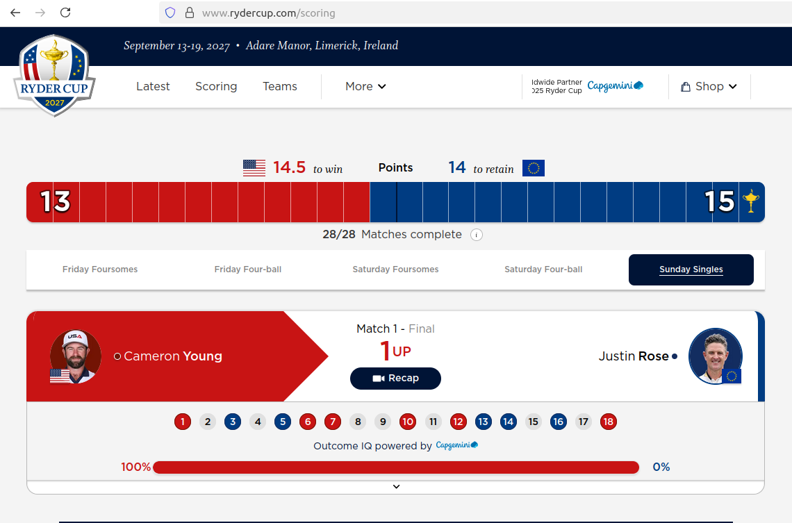
What was my point? Oh yeah! Despite this aforementioned disinterest in golf, this weekend featured a lot of it! I didn’t watch any, but the Ryder Cup totally hooked me in. And I realised it’s because I love a good story, and I love a good graphic. The Ryder Cup has basically nailed these two things. Ultimately it didn’t matter about the blokes pushing the little ball into the hole, but the scoring of points, the data, the up and the down, it was so good.
It really helped that my son was also engrossed in it, he followed each and every shot, every half point, every possibility, and fed it back to me. He explained it to me in a way that made sense and when he told me the board was full of blue (most of the first two days), or worryingly red (most of Sunday) I knew what he meant…
And how good was that bar!?
It was like the election night swingometer all over again…
- I realise I have mentioned my love of cricket previously, and I’m fully aware that any reason I could give for not liking football or golf could easily be countered with “but how on earth can you like cricket?”